Freedom From Meh Design: Sports Logo Design Disaster & the Power of Visual Brand Guides
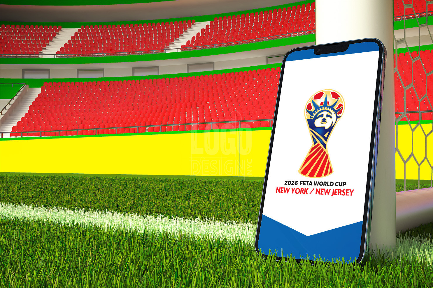
A well known 2026 Sports Logo Design Disaster is what can happen when companies go rouge and attempt the art of logo design without a visual branding guide. Disclaimer: This is a satirical article. We have no clue if their design team used a brand guide or outsourced their design to AI – as we did for (parts of) our featured parody logo (to sidestep trademark concerns). TLDR: We are not affiliated with the World Cup in any way.
A Misguided dive into minimalism
The Women’s World Cup 2023 ended with Spain winning its first ever world title. That was big news in the sports world. As a Logo Design Company, we will steer clear of post-game analysis. That said, with dominating headlines in 2023, we can’t help but share our thoughts on the future of their branding…
Their 2026 logo appears to be yet another casualty of the overzealous minimalist logo design movement. At best, it’s peak debranding; at worst, it’s a high crime against good design.
Their attempt at minimalistic elegance instead strips the brand bare. The iconic yet flat World Cup Trophy is awkwardly superimposed on a barely legible white number 26. It looms over the stark black letters, like What We Do in the Shadows’ insidious energy vampire, Colin Robinson, ready to suck the life out of anyone who passes by. Unlike Colin, who meticulously crafts mundane tales to drain his victims, the 2026 World Cup logo fearlessly plummets, draining the vibrancy out of the entire brand with it.
“The World Cup Trophy looms over the stark black letters like What We Do in the Shadows’ insidious energy vampire, Colin Robinson, ready to suck the life out of anyone who passes by. This kind of Logo Design Disaster is inevitable when companies go rouge, attempting the art of logo design without a (solid) visual branding guide.“
Brand Identity Crisis: A Logo without Purpose
The World Cup logo’s most glaring transgression is the disregard for its own purpose—to reflect the essence of the brand it represents. They completely misses incorporating visual representations—or even colors—of the host nations: USA, Mexico, and Canada. The the supposed rallying cry, “WE ARE 26,” falls flat.
It’s no wonder that a quick Google search returns hundreds of accusations against the logo ranging from “bland, boring, and uninspired,” to “Sad beyond belief.” Results from the social media platform formerly known as Twitter were even more entertaining. (See now slightly outdated Twitter screenshots in image gallery for two of our favorite examples.)
A Vision Unrealized: What logo design nyc would do differently (It all starts with a custom brand guide)
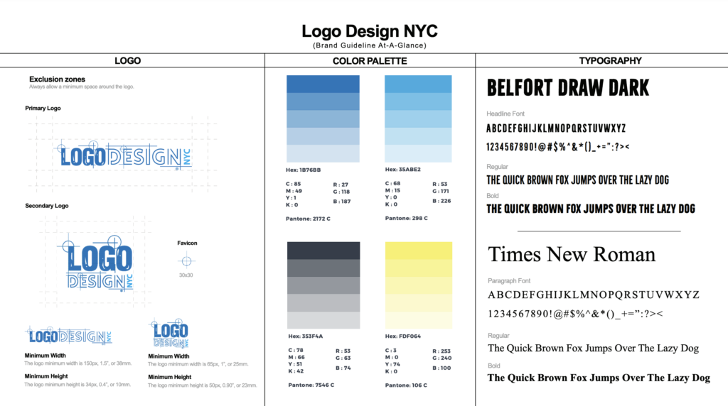
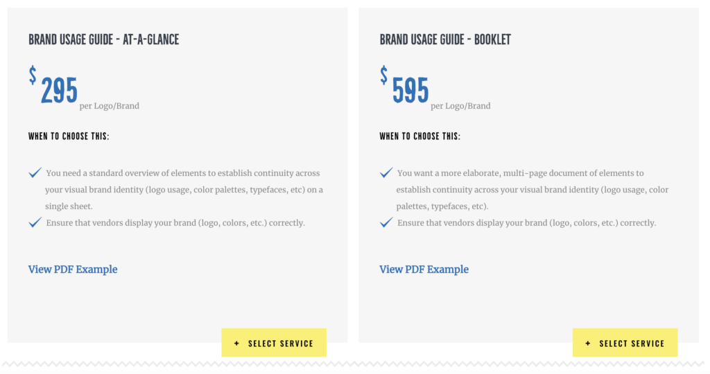
To begin, our team at Logo Design NYC would turn to their visual brand guide. If one doesn’t exist, our first order of business would be to craft a custom one tailored for them. Given their status as a worldwide, multi-billion dollar organization, we’d naturally gravitate towards our comprehensive Brand Usage Guide Booklet. This document serves as a detailed, multi-page ‘bible’ of branding, encapsulating crucial elements needed to ensure consistency throughout every aspect of a company’s visual brand identity. It includes instructions for logo use and acceptable variations, specifies color palettes, outlines typefaces, and more.
“Those who neglect to follow a company’s visual brand guide risk not just the ire of the design deities, but also the scorn of a far more relentless force: the unforgiving consumer.”
In our hypothetical role as their Logo Design team, we would would strive to capture the dynamism, passion, and impact of the global custodians of football. An exploration of cultural symbols or colors representing the USA, Canada, and Mexico would have been an integral part of the design process. Yes, we would find a way to incorporate something resembling a soccer ball.
The goal here for the team behind their 2026 logo was to translate the ethos of the sport and its worldwide fan base into a design that stirs anticipation, not bewilderment. The logo should declare: “This is football.”
See how Logo Design NYC would have infused dynamism, passion, global unity, into the World Cup Logo by visiting our Instagram account. Unlike our featured image and parody FETA logo, our logos are 100% custom, created by real human designers. If you want to see more of our work check out our Logo Design NYC portfolio.
WHAT WE CAN LEARN FROM this Sports Logo DESIGN
Rules can be broken to spark innovation, but only when brands understand the fundamental principles to begin with. A company’s investment in a visual brand guide gives designers a valuable resource. This guide serves as the company’s branding bible. Skilled designers adhere to it as keenly as ancient philosophers once interpreted life’s rules for society. Those who neglect to follow it risk not just the ire of the design deities, but also the scorn of a far more relentless force: the unforgiving consumer with a Twitter account.
Looking at the bright side, every design disaster holds a valuable lesson. If we take away anything from their 2026 logo, let’s remember our power to shape perceptions and forge brands – for better or worse. May future generations view the 2026 mishap as a powerful reminder of the perils of deviating from, or operating without, a visual brand guide.
No visual branding guide? No problem! Get Logo Design NYC’s exclusive brand usage guide today to avert disasters tomorrow.


