Rebranding a Beloved Doughnut Shop
Nestled within New York’s vibrant boroughs, DOUGH Doughnuts stands out as a beloved culinary treasure, blending the city’s diverse flavors and spirit. Embarking on a rebranding journey with this esteemed doughnut chain was both a privilege and an exhilarating challenge. Our goal was to harmonize traditional values with innovative design, drawing inspiration from the myriad of unique tastes we’ve enjoyed at their flagship Flatiron store.
Starting with an initial conversation with the owners, we set out on a fantastic voyage to revamp their aesthetic, aiming to infuse a fresh, yet traditional vibe into this cherished spot. With multiple locations across Brooklyn, Queens, and Manhattan, DOUGH has become a beacon for those seeking a gourmet twist on the classic American doughnut. Our restaurant branding agency was given the unique opportunity to reimagine Dough’s decade-old identity, transitioning from their humble kraft boxes to exquisite doughnut packaging design. This system wasn’t just a facelift—it was a strategic narrative, a declaration of Dough’s evolution in the gourmet pastry space.
From Kraft to Branded Boxes
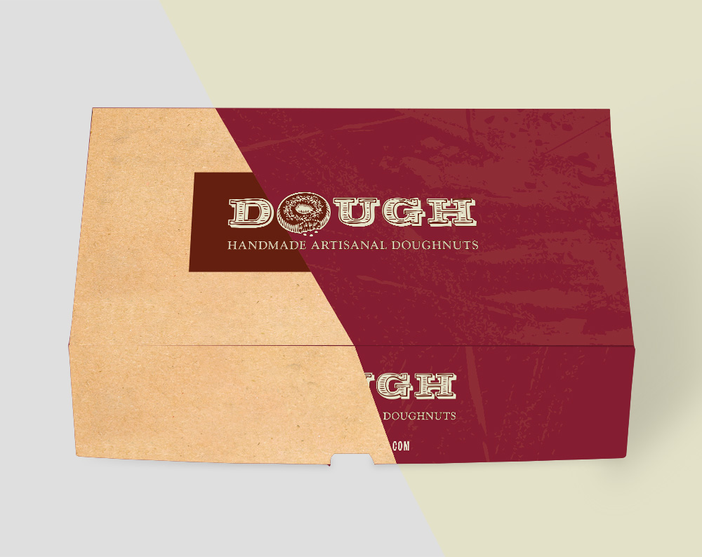
As the artisans of Dough’s brand metamorphosis, we were cognizant of the heritage we were tasked to honor. Dough’s old kraft boxes were synonymous with their no-nonsense approach to quality—trustworthy and reliable, like the boroughs they serve. The challenge was to weave this trust into a tapestry that spoke of innovation and cosmopolitan flair. We needed to craft a visual language that would resonate with the diverse demographic of New Yorkers and visitors alike, across all their locations. In crafting the design for Dough’s new box, our focus was on creating something that would stand out on the bustling streets of New York. We aimed to create a visual beacon that would spark curiosity and desire among those who caught even a fleeting glimpse of it. The goal was to transform each Dough doughnut box into a mini billboard, an invitation to indulge in some of the city’s finest treats.
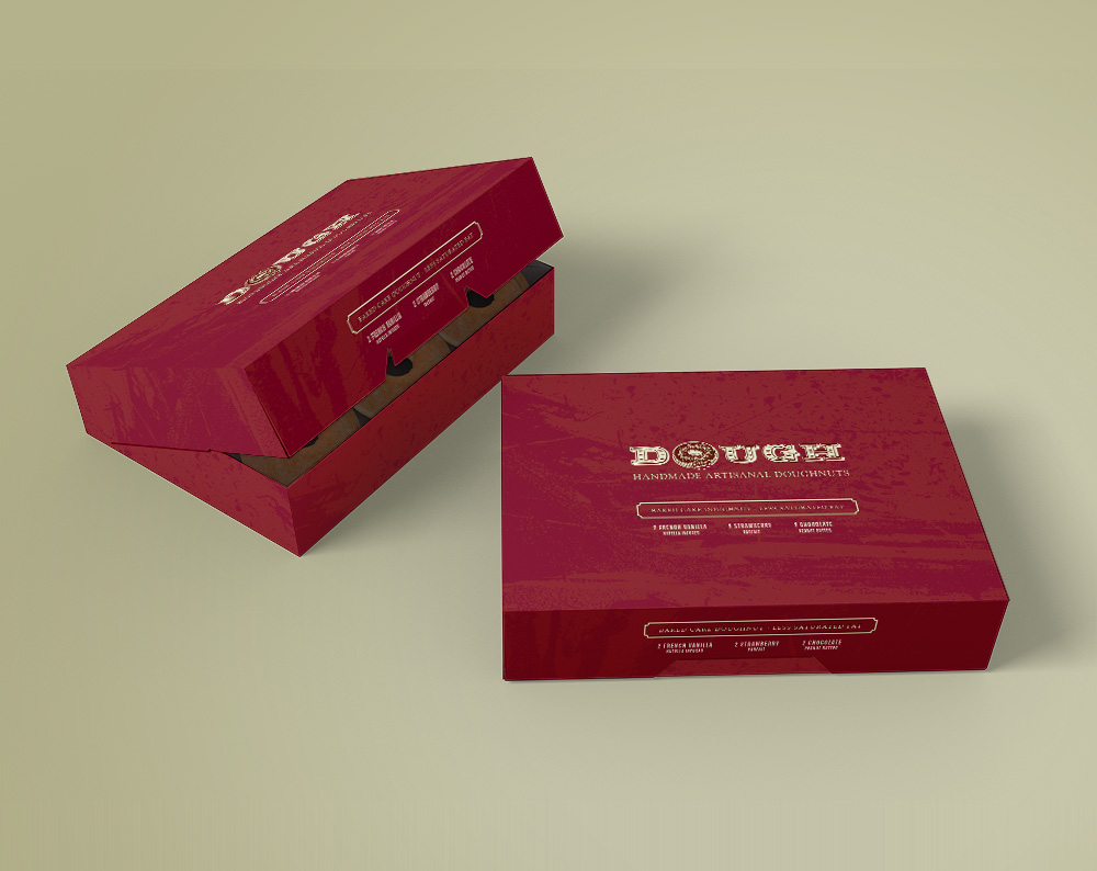
In the diverse and dynamic landscape of New York City, Dough Doughnuts carved out a reputation for quality. With multiple locations, Dough stood as a culinary landmark, serving gourmet pastries in simple, reliable kraft boxes that New Yorkers had come to trust. The transformation was not just aesthetic but sensory. We chose a deep maroon for the packaging—a color that evokes richness and a nod to the sumptuous variety of doughnuts. The color was not chosen lightly; maroon is the hue of choice for those who favor the sophisticated over the common, the extraordinary over the ordinary. It is a promise of a luxury experience. The texture on the box, a delicate dance of marble frosting, hints at the complexity and layers of flavors Dough is known for. Each box in hand is a prelude to the symphony of tastes that await—the sweet, the savory, the unexpectedly delightful. This texture is more than a visual element; it is an invitation to touch, to feel, to engage with the brand in a tangible way.
Every location, be it in the historic streets of Brooklyn, the bustling avenues of Manhattan, or the diverse neighborhoods of Queens, now has a cohesive yet flexible identity that carries the essence of the Dough brand. From the coffee cups that warm hands on cold New York mornings to the delivery bags that carry joy across the city, each piece tells a part of the Dough story. Our ambition was for the maroon doughnut box to become an iconic symbol on the streets of New York, instantly recognizable even in the briefest encounters between pedestrians. We envisioned these boxes as mobile advertisements, heralding the quality and distinctiveness of our doughnuts. This strategy aimed to not just capture attention but to embed our brand into the city’s visual landscape, turning every customer into a brand ambassador simply by carrying our box.
Beyond the box design
But it was not just about creating a beautiful package. It was about enhancing the in-store experience, about aligning the physical presence of the boxes with the warmth and welcome of Dough’s staff. It was about ensuring that whether a customer was a first-time visitor or a long-time local, they felt a part of the Dough family.
In our rebranding efforts, we prioritized maintaining Dough’s established reputation for quality and freshness while introducing elements that showcased their innovation in the doughnut industry. We made sure that the design elements were not just beautiful but functional, with packaging that protected the precious cargo of doughnuts as effectively as it turned heads.
Our design team conducted extensive research on current trends, consumer behavior, and the timeless appeal of classic New York establishments to deliver a packaging design that is both current and classic, innovative yet familiar. We engaged with Dough’s team at every location to ensure the new packaging resonated with their local clientele while retaining the ability to draw in new patrons. We infused the packaging with an air of modern elegance, selecting a deep maroon to elevate the brand’s narrative and signify its evolution into a gourmet confectioner.
Through our collaboration with Dough, we have not only given a new visual identity to a beloved New York institution but have also contributed to the city’s ever-evolving narrative—a narrative that values both history and progress. The result of our partnership with Dough is a packaging design that encapsulates the brand’s commitment to quality, its embrace of New York’s eclectic spirit, and its vision for the future of gourmet pastries.
The Sweet Outcome
The rebranding effort transcended aesthetics, positioning Dough as a gourmet icon that carries a piece of New York’s heart in every bite. The redesign journey reflects a successful marriage of form and function, setting Dough on a path to new horizons in the city’s doughnut lore.
Now, when customers from Brooklyn to Manhattan, Queens to beyond, hold a Dough box in their hands, they hold a piece of New York itself—a piece that is as much a testament to the city’s past as it is a beacon for its future. Finally, the piece would reflect on the transformative power of the redesign and how it’s solidified Dough’s place in the future of New York’s doughnut lore, inviting customers to savor not just a doughnut, but a piece of the city’s heart; and we were proud to be part of it.
If your doughnut shop or restaurant brand identity is lacking consistency across all marketing materials, our team is here to help. Engage with our brand consultants to explore a world of possibilities tailored specifically to elevate your brand. Let’s start a conversation about transforming your vision into a tangible reality that resonates with your audience.


